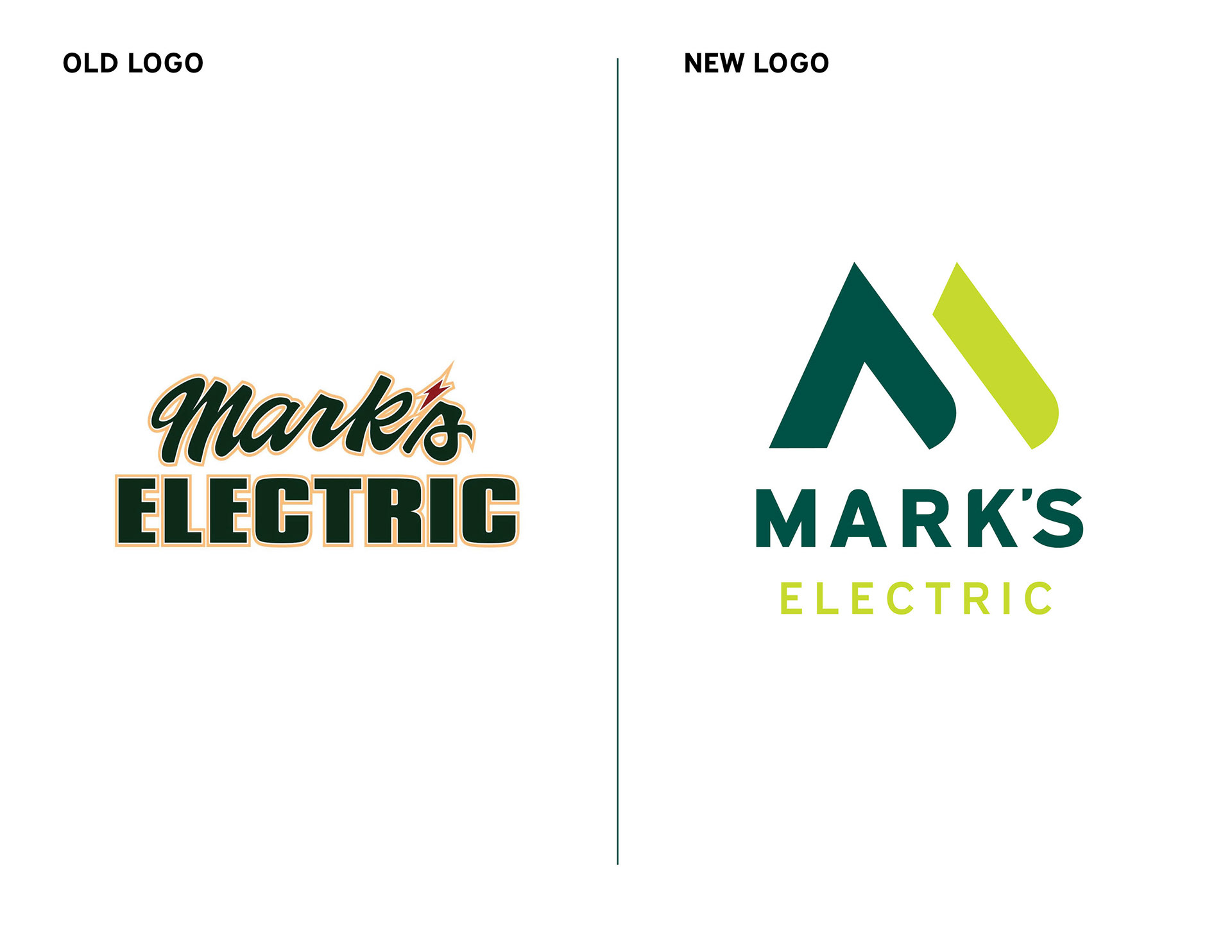


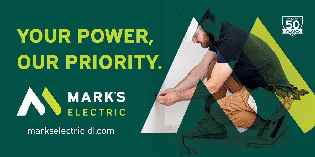

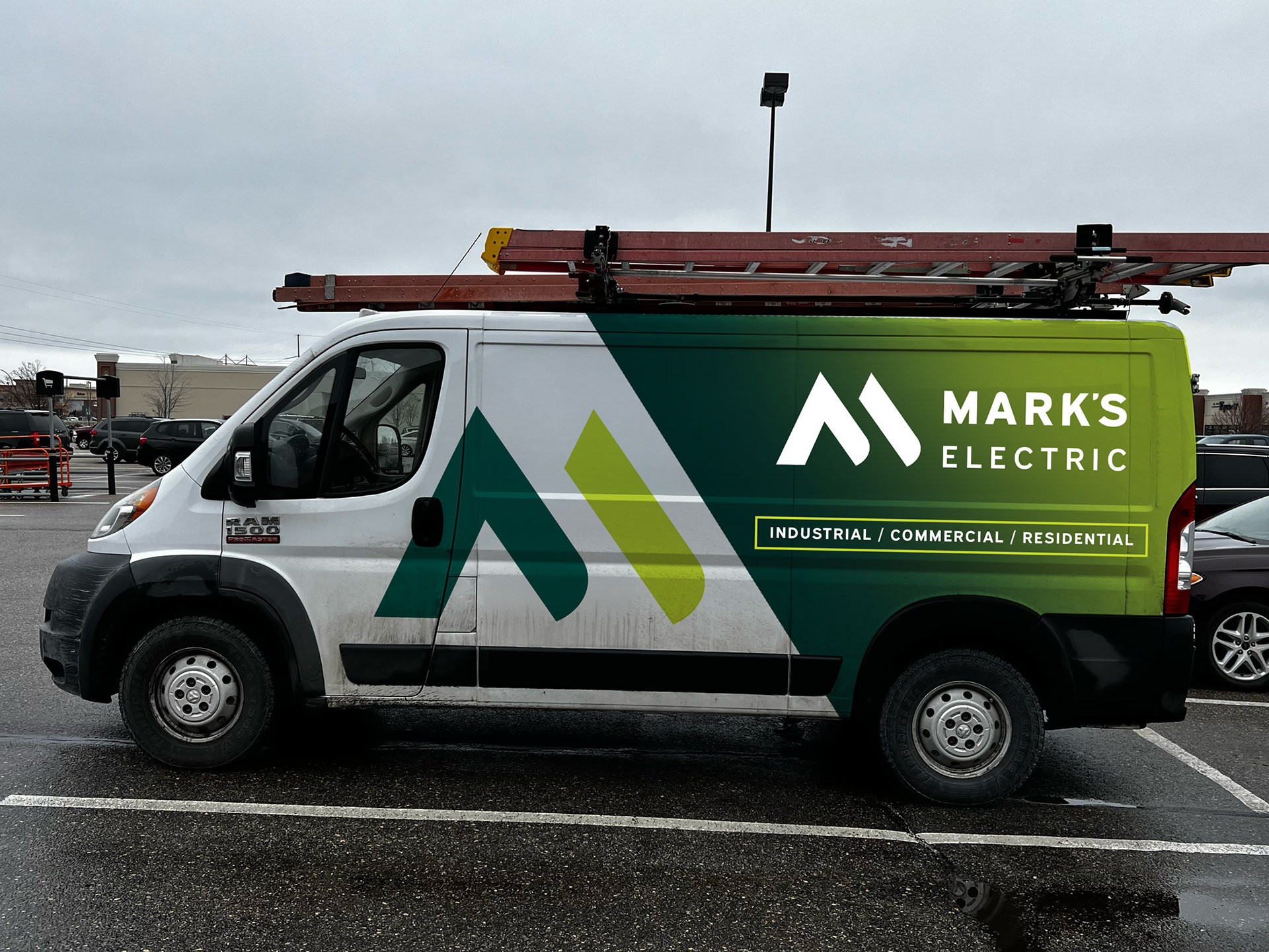
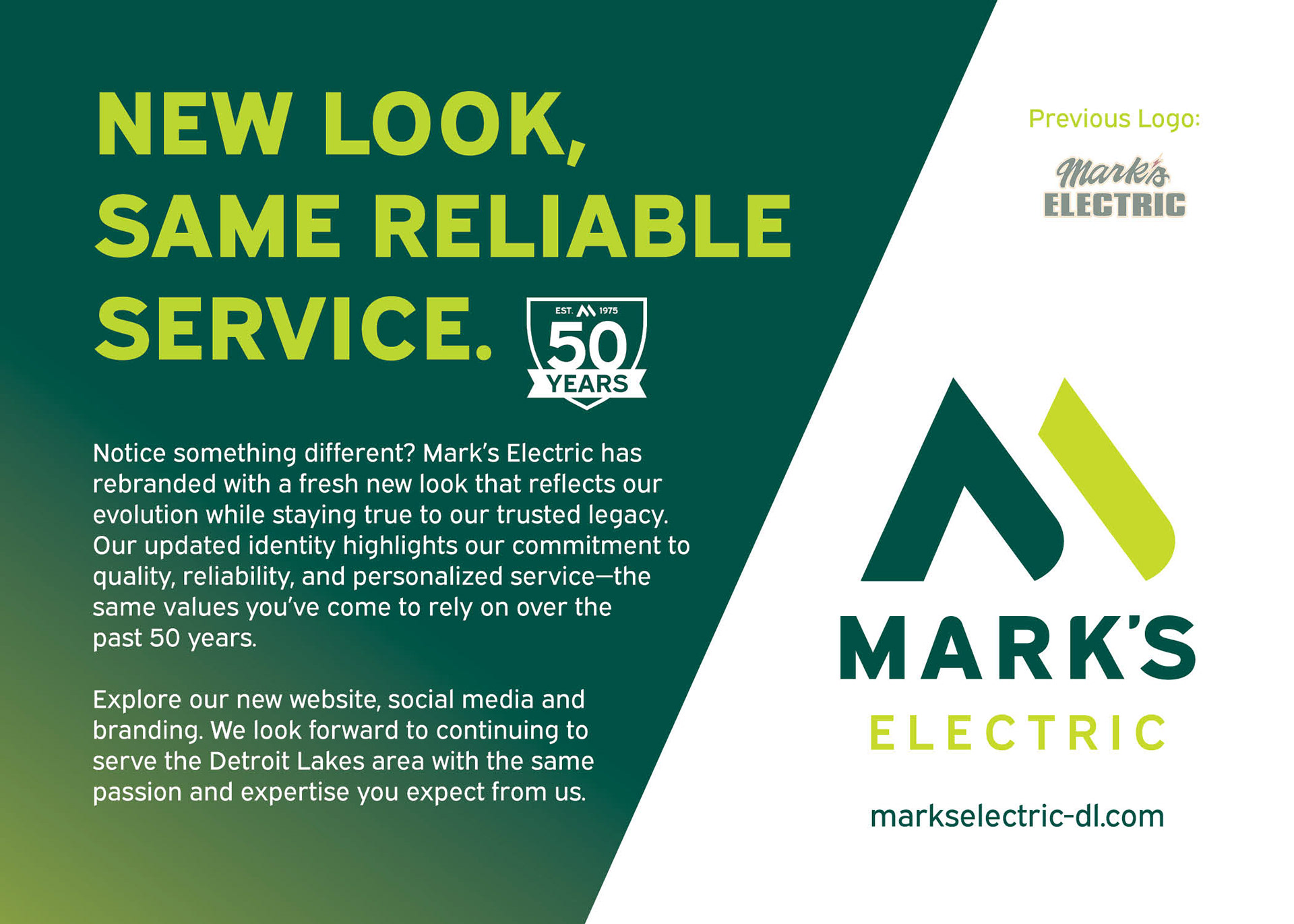


The Mark’s Electric logo was designed to convey professionalism, trust, and a no-frills approach to quality electrical work. Its clean, bold typography reflects the company’s straightforward values and strong reputation in the community. By avoiding overused symbols like lightning bolts or light bulbs, the logo stands out with a timeless, refined look that feels grounded and confident. It’s a design that speaks to experience and reliability—no gimmicks, just solid work.
www.markselectric-dl.com
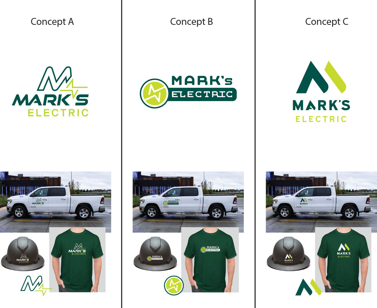
Original Concepts