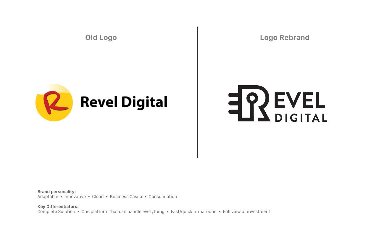
Revel Digital is a next-generation platform for digital signage and media distribution. The company’s existing logo was due for a refresh to better reflect its technological focus and position in the modern enterprise market. The goal was to develop a visual identity that communicated speed, adaptability, and comprehensive functionality—positioning Revel as an all-in-one solution with fast turnaround, transparent ROI, and scalability for large businesses.
The updated logo introduces a bold new color palette and a modern, tech-forward aesthetic. A key request from the client was to retain the capital “R” as a central brand element. To set Revel apart from competitors—many of whom use simple sans-serif wordmarks—I developed a custom “R” icon that functions both within the logo and as a standalone brand mark.
The design is rich in subtle meaning: the center of the “R” symbolizes a sensor, referencing the interactive technology integrated into Revel’s signage systems. The left-side prongs represent a microchip, reinforcing the brand’s identity as an innovative technology provider. The overall look strikes a balance between clean, modern, and business casual—aligned with the company’s vision of smart, streamlined digital communication.