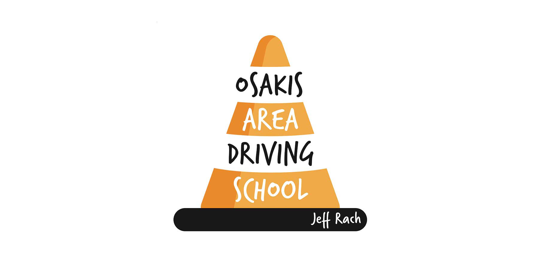
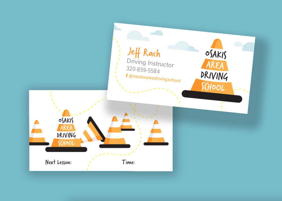
This project involved creating a logo and business card for a driving school focused on teen learners. Drawing from personal experience, I incorporated the image of a traffic cone—a familiar symbol of learning to drive and, notably, mastering parallel parking—to make the brand instantly recognizable and approachable.
To resonate with a younger audience, I selected a playful, friendly typeface that feels modern and inviting. The business card was designed with function in mind: the reverse side includes a dedicated space where the instructor can write the date and time of the student’s next lesson, making it both a branding tool and a practical resource.